Planview had grown through acquisition. 12 enterprise SaaS tools. Different teams, different design languages, different interaction patterns for the same tasks. Users who moved between products daily were constantly relearning. This was a system problem that needed a system solution.
Products acquired or built independently had accumulated their own UI patterns, terminology, and interaction behaviors. A project manager moving between two Planview tools daily encountered different button placements, different naming conventions, different workflows for identical actions — not just slowing them down, but actively eroding their confidence in the platform.
Leadership aligned on three goals: improve UX consistency, reduce redundant design and engineering effort, and enable faster delivery of cross-product features. We had six months to show meaningful progress and secure continued investment.
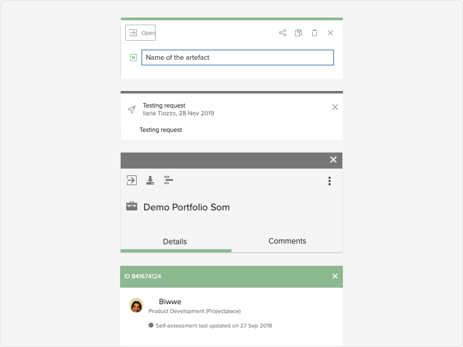
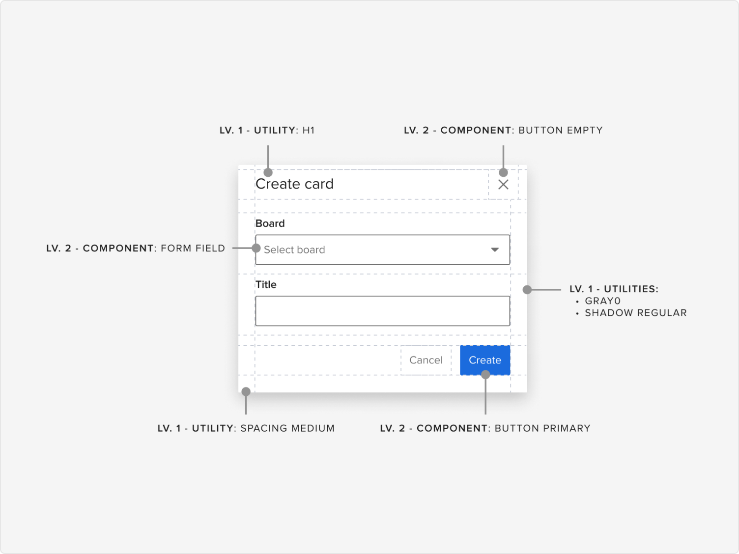
We kicked off with a comprehensive UX audit across all seven products, cataloguing over 60 components that existed in different forms — buttons, modals, date pickers, navigation patterns. The discrepancies weren't just cosmetic; they impacted usability, accessibility, and trust.
Workshops with cross-functional stakeholders and contextual interviews with power users surfaced the same frustrations repeatedly. We distilled the findings into three key personas: Project Manager Paula (managing multiple workstreams across tools), Developer Dan (implementing features across the portfolio), and Admin Analyst Anita (building custom dashboards and views). Each highlighted different friction points — but all pointed to the same root cause: no shared foundation.
"Creating a report works completely differently in each tool. I never know which steps apply. I just guess and undo a lot."
— Power user, enterprise clientI began by establishing three design principles to anchor every decision: consistency over customisation, longevity for scale, and accessibility by default. These weren't aspirational — they were decision filters we returned to throughout the project.
Weekly design system "jams" brought together designers from across the organisation to co-create patterns and vote on approaches. One of the earliest and most impactful deliverables was a shared taxonomy — standardising terms like "workspace," "project," and "board," which had different meanings across tools and created onboarding confusion, support overhead, and navigation dead ends.
We also studied how leading platforms — Atlassian, Salesforce Lightning, Adobe Spectrum — approached tokenisation, governance, and developer alignment. Their approaches shaped how we structured the system for long-term maintainability.
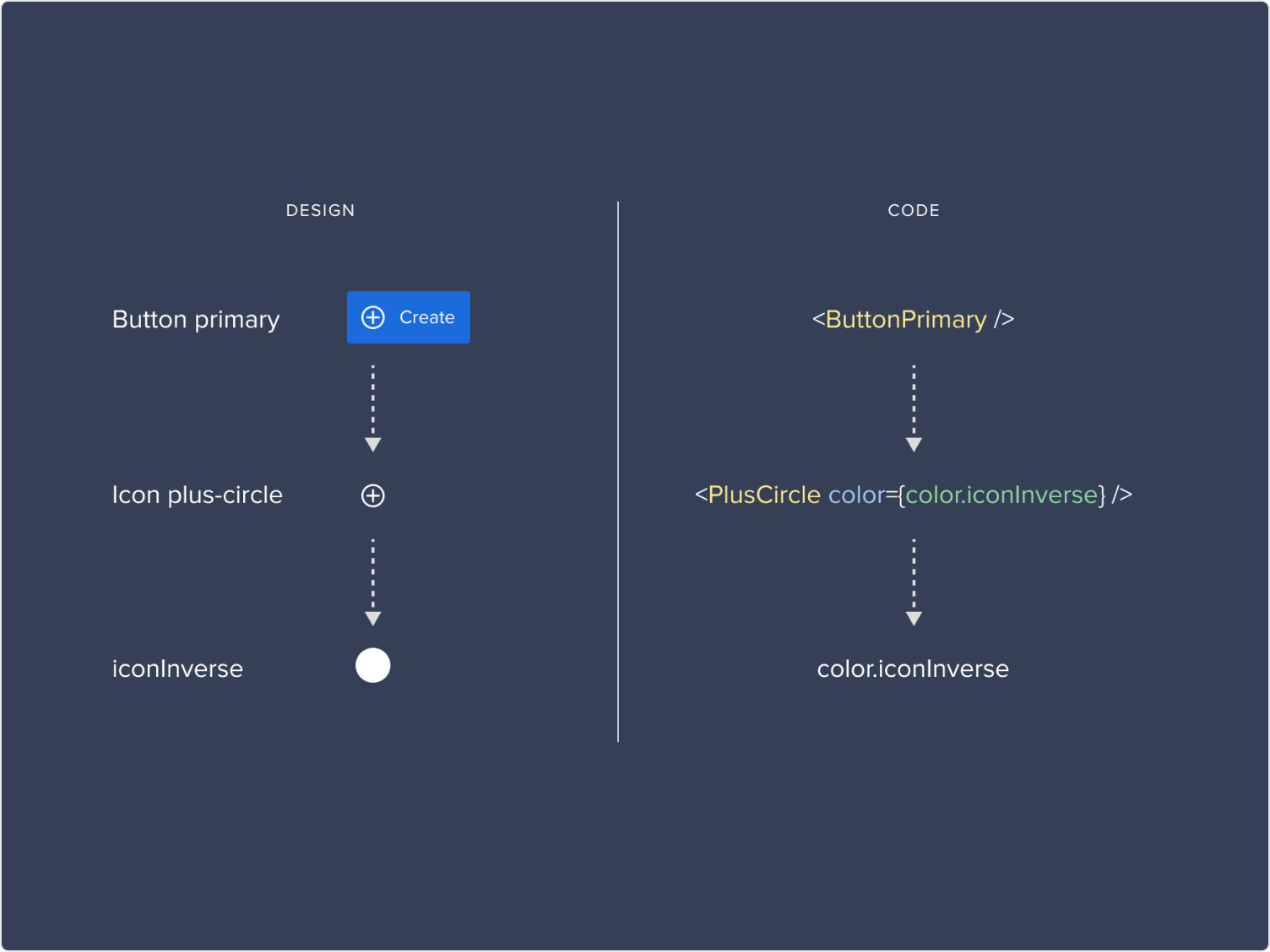
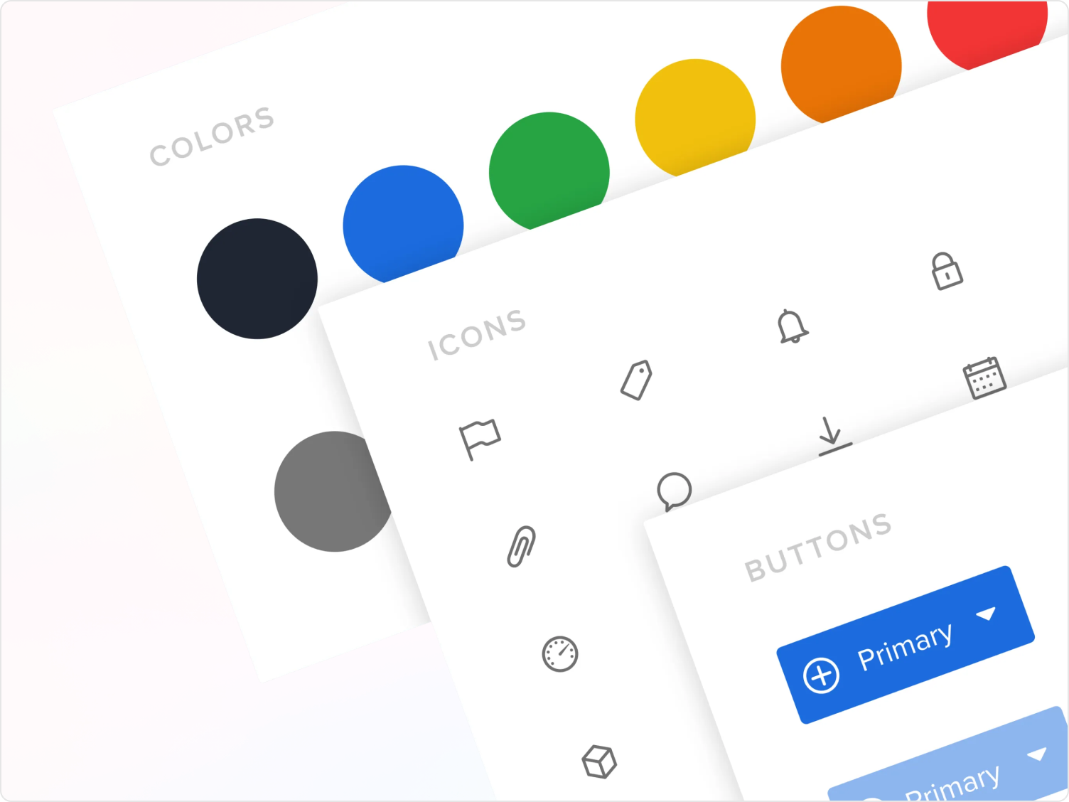
Built using Auto Layout, component variants, tokens, and variables — providing flexibility without sacrificing consistency. Over 100 foundational components with detailed usage and accessibility documentation, all living in a single shared library.
I partnered closely with front-end engineers to implement design tokens consistently in code via Storybook. This reduced handoff friction significantly and enabled real-time collaboration when iterating on component behavior — instead of the usual back-and-forth.
Color contrast audits, keyboard navigation testing, and ARIA guidance were built into component specs from the start — not retrofitted. Accessibility wasn't a checklist; it was a baseline requirement for every component in the system.
All design patterns, usage guidelines, and contribution processes were documented in a living system that designers and engineers could rely on, contribute to, and evolve — reducing tribal knowledge and enabling faster onboarding.
We prototyped shared flows and ran usability tests with internal teams and select customers, alongside structured A/B sessions comparing legacy UIs with systemised components. The results were consistent: users found the new patterns more predictable, designers reported less friction at handoff, and developers could implement faster with fewer questions.
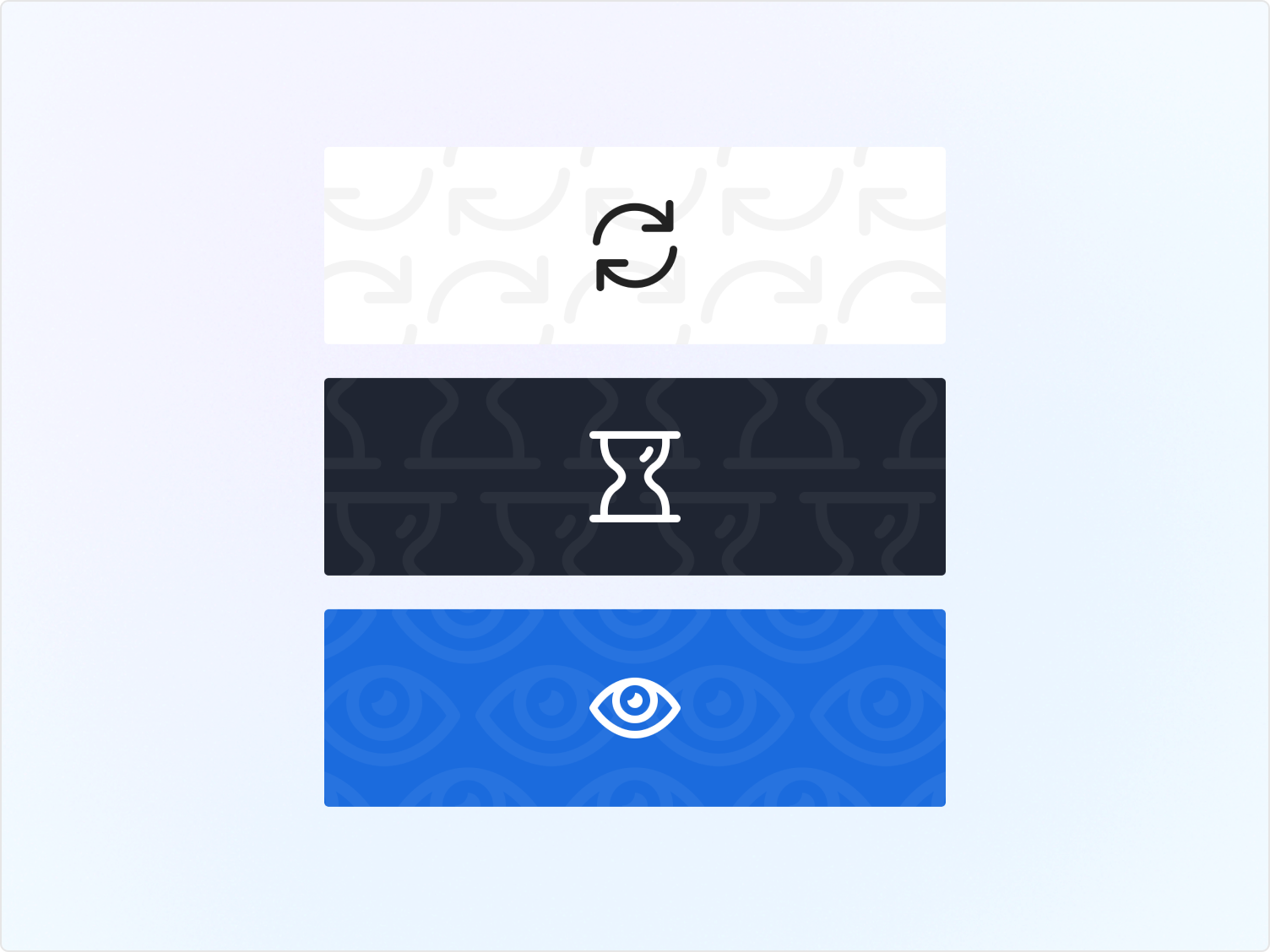
We tracked adoption through usage analytics and design reviews, sharing wins and learnings across the organisation. Concrete before-and-after comparisons — like consolidating three inaccessible date pickers into one that met WCAG standards — made the system's value visible and tangible.
I led the initiative alongside a UX Manager, three product designers, two front-end engineers, and a PM. The real leadership challenge wasn't the design work — it was managing change. Designers were used to flexibility. Some were hesitant to adopt standardised patterns they hadn't authored.
By listening, demonstrating value early, and co-creating with teams rather than mandating from above, we gradually earned trust and buy-in. The system became a shared asset — not an external constraint — because the people who would use it helped shape it.