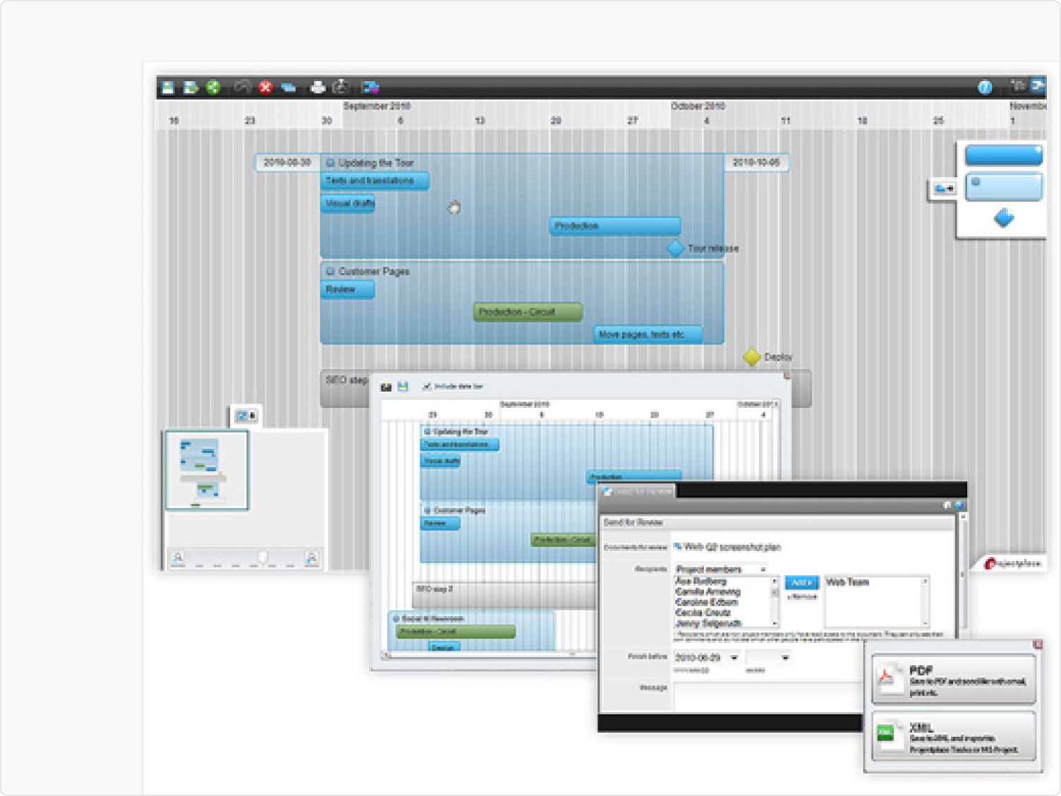
ProjectPlace's Gantt was one of the most-used features in the platform and the most avoided. Teams opened it at kickoff and abandoned it the moment work moved to execution. The problem wasn't the interface. It was that the tool had stopped earning trust. This was about rebuilding it, from research to delivery, fully owned end to end.
Inner Circle sessions and Pendo event analysis revealed four friction points that kept surfacing across teams.
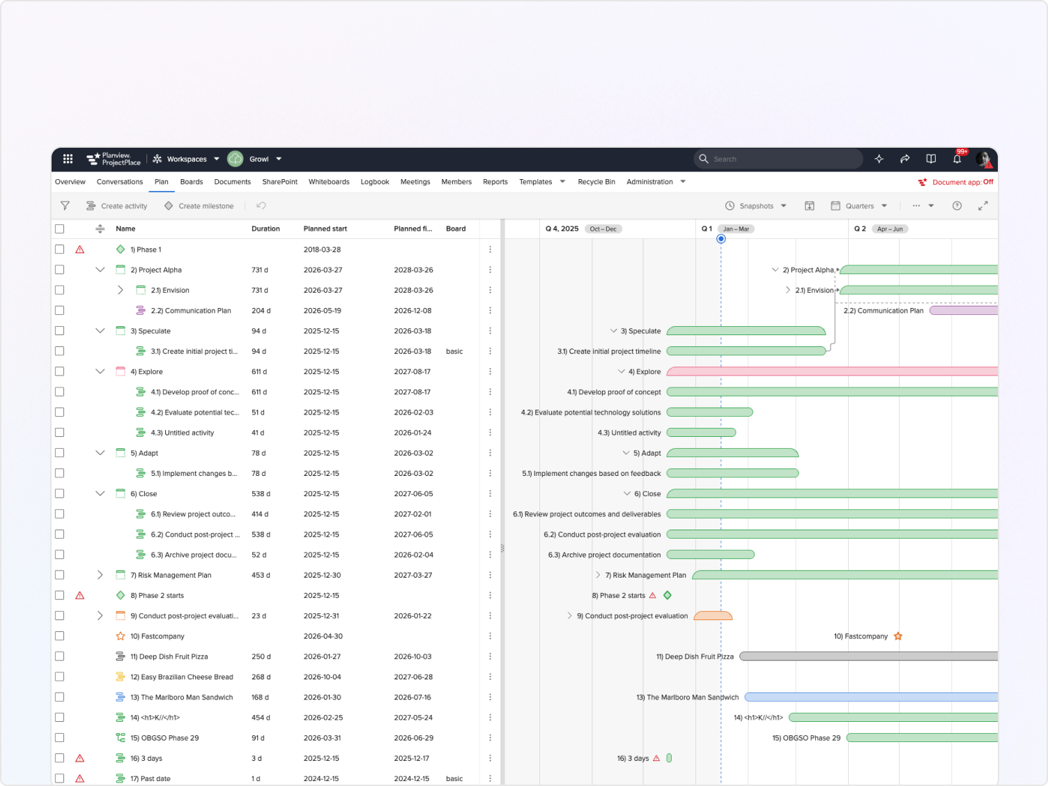
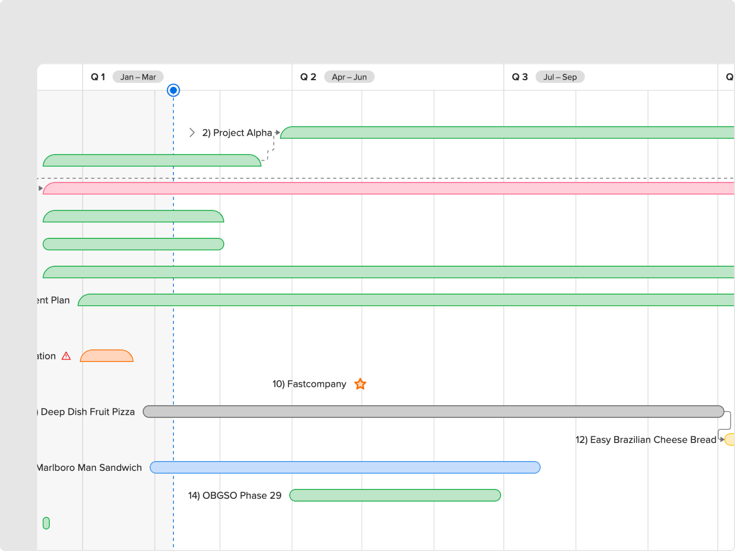
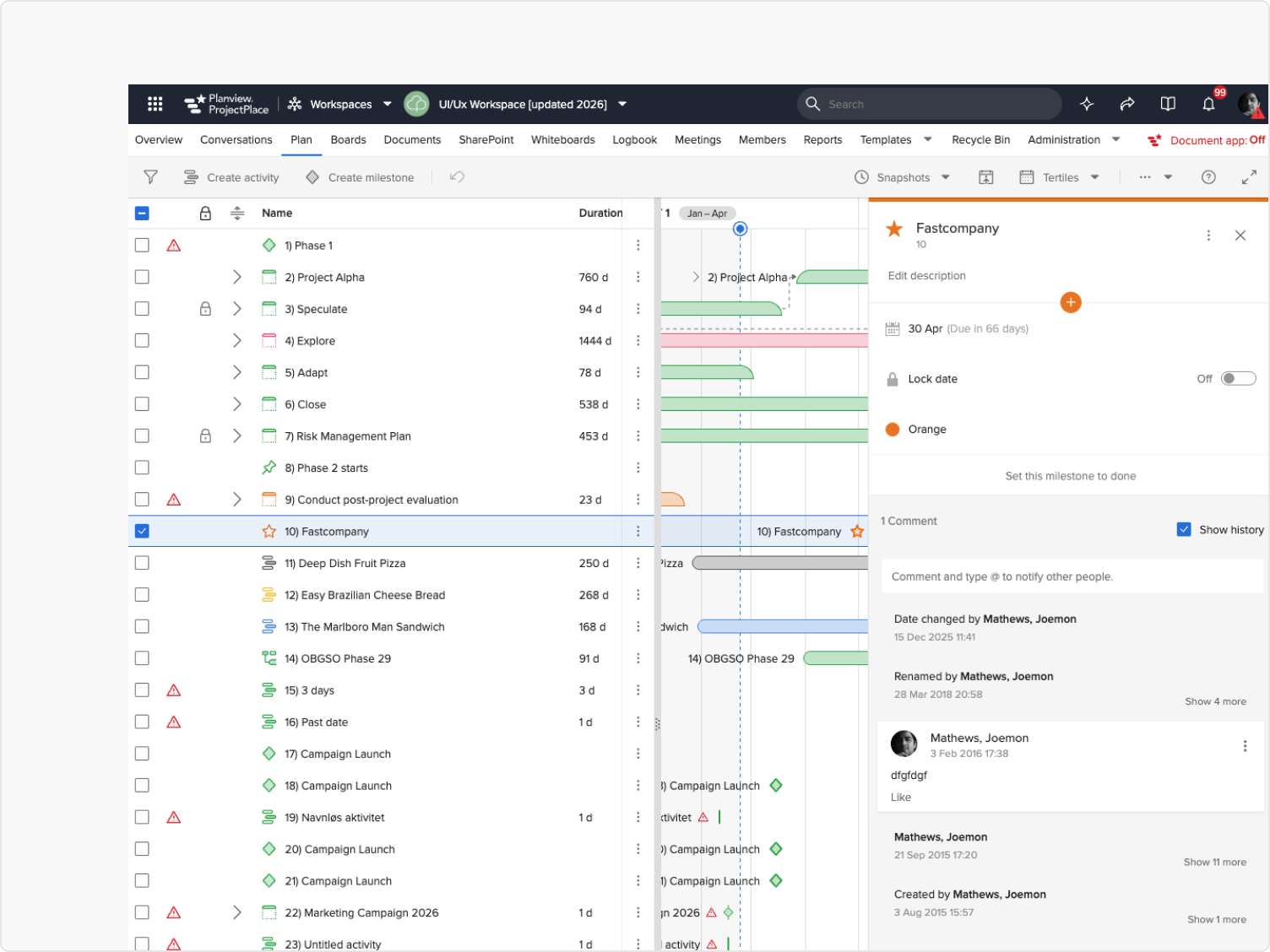
Once work moved to execution, the plan had no awareness of progress. The Board column existed but was rarely connected, leaving the Gantt as a schedule with no sense of reality.
There was no way to tell what was connected to what. Moving a task could silently affect others, so users simply avoided making changes.
Editing required navigating away from context. The tool didn't invite updates, so the plan drifted further from what was actually happening.
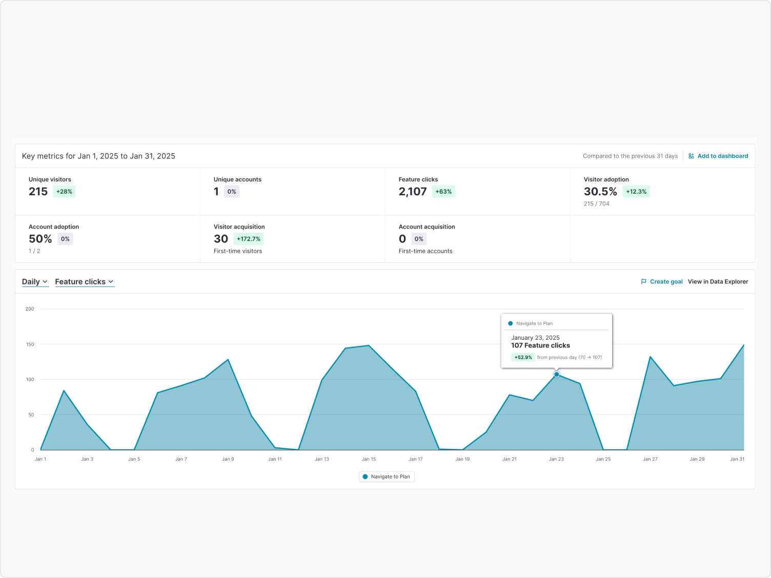
With no way to filter or focus, the view became overwhelming for large projects, making it easier to abandon the plan than to maintain it.
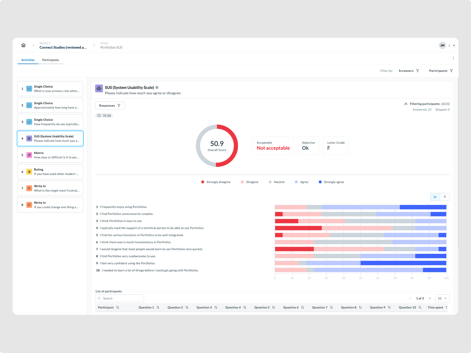
A System Usability Scale study across 22 participants returned a score of 50.9, rated "not acceptable," letter grade F. That data, combined with Pendo signals, formed the case presented to leadership for focused intervention over a full rewrite. The goal wasn't to redesign everything. It was to fix the specific friction points that had caused users to stop trusting the plan.
"I can never tell if moving this task is going to break everything else. So I just don't touch it."
— Project Manager, enterprise client
Dependency relationships were made visible directly on the Gantt. Users could now see what was connected before making a move, eliminating the silent breaks that had trained them to avoid edits altogether.
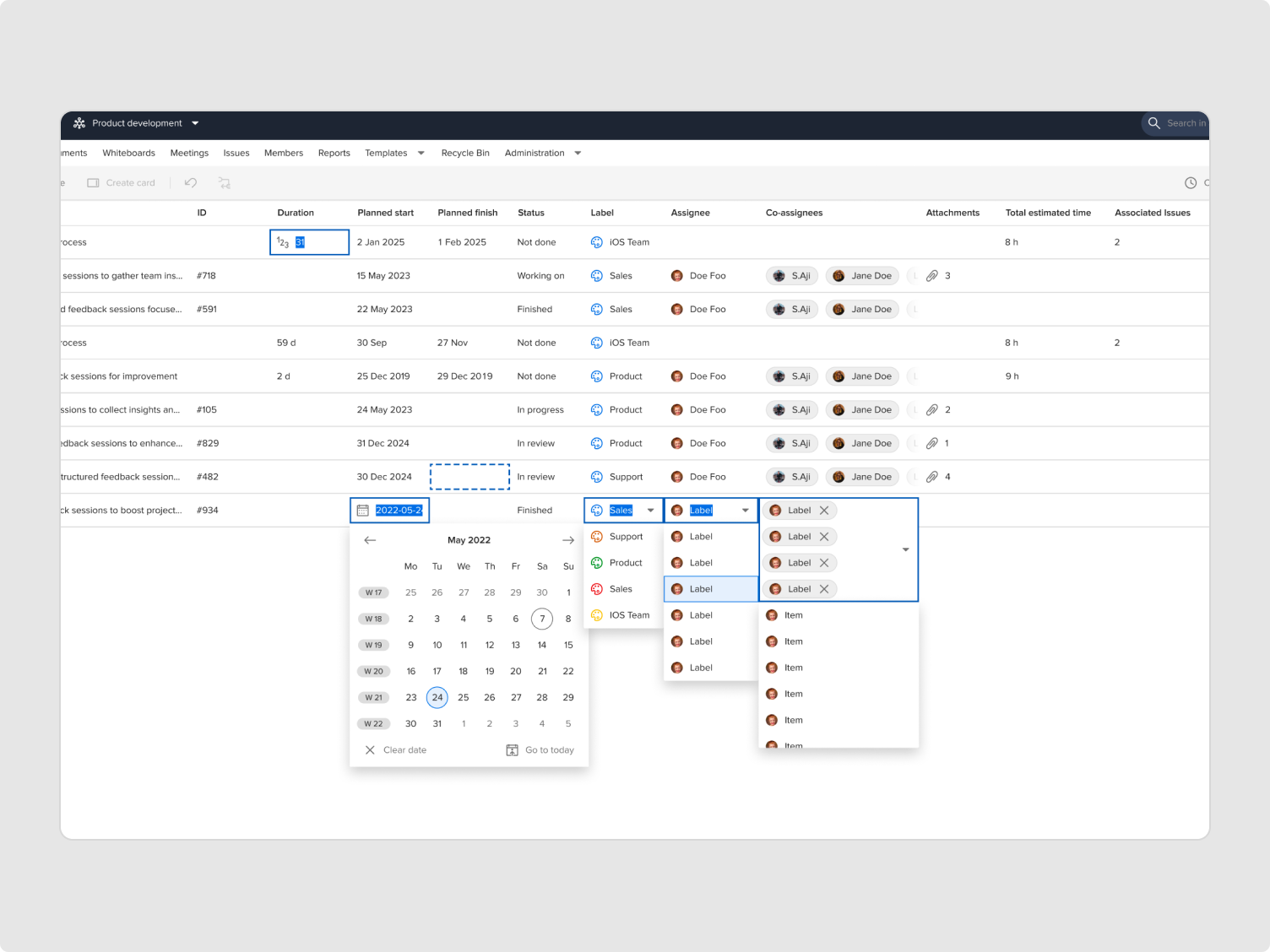
Editing was brought into context. Dates, labels, assignees, all editable inline without navigating away. The plan became something teams could update in the moment, not something requiring a separate session to fix.
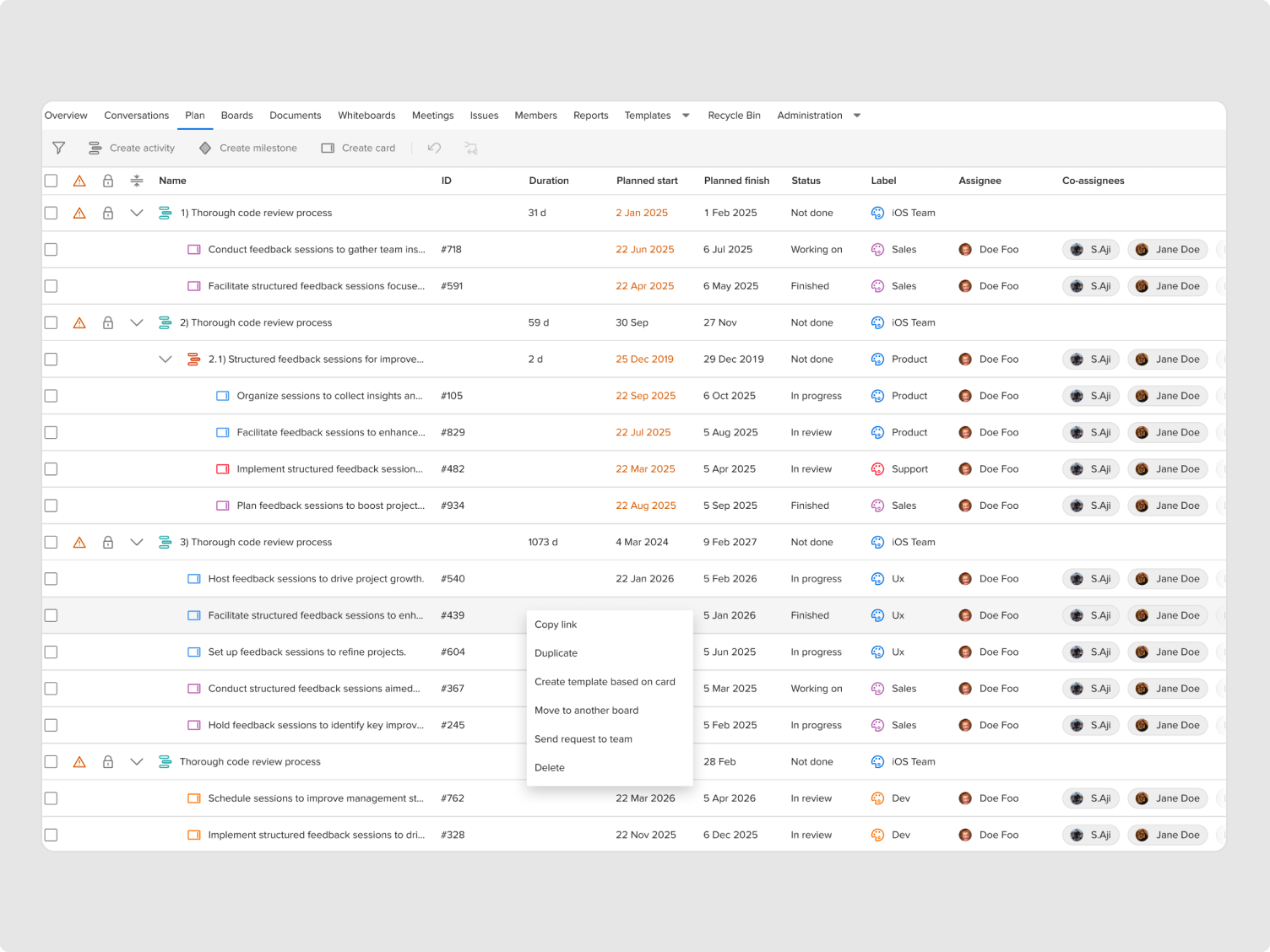
The gap between planning and execution was closed by surfacing board cards directly within the plan view. And because ProjectPlace sits within the broader Planview ecosystem, this connection extended further, linking the plan with Portfolios and PPMpro, giving teams a unified view across all three products for the first time.
I did not redesign the entire interface, change the visual language dramatically, touch backend scheduling algorithms, or introduce heavy animation frameworks. Engineering capacity couldn't support it, the risk of destabilizing enterprise workflows was too high, and the timeline didn't allow proper validation cycles.
The initial response from engineering was clear: any change near dependencies is risky. Rather than insisting on ideal UX, I co-mapped edge cases with engineers, reduced interaction complexity, and removed three proposed enhancements after feasibility review.
I shifted from designer proposing solutions to partner protecting system stability. That changed the trust dynamic entirely and unlocked the collaboration needed to ship.
This project was owned end to end, from running the research and framing the problem, to aligning leadership on the approach and partnering with engineering through delivery. The PM supported prioritisation, but the design direction, stakeholder narrative, and delivery ownership sat with design throughout.
Getting engineering on board required a shift in how the work was presented. Co-mapping edge cases, adjusting interaction complexity based on feasibility, and cutting scope where risk outweighed value, that approach changed the dynamic from designer pushing for changes to partner protecting the system.